


You could do worse than hand someone a business card for your city whose logo you might describe with adjectives like “tasty,” “mouthwatering” or “scrumptious.”
Case in point: Henderson, Nevada, whose city logo was once mistaken for a hamburger, according to city manager Jacob Snow — and now, he told the Las Vegas Review-Journal, he’s hoping to change it.
(WATCH: Five Guys From Harvard Send A Hamburger Into Space)
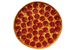
Check it out: The golf greens might be pickles, ones of the houses a bit of tomato, the desert hard-pack a slice of gourmet cheese (or mustard). That cactus could be a strand of arugula. And the purple mountains? The patty itself, of course, with the sun peeking over like a pat of butter.
Okay, so up close the logo, originally adopted in 1993, looks nothing like a hamburger. But imagine the 14-color design shrunk to business-card size and, well, as they say, there’s no accounting for taste.
“It just all blends together, and it looks like a hamburger,” said Snow, noting he also wants to nix the shred of lettuce — err, “saguaro cactus” — used in the current image to signify the city’s desert vibe. Why? Because the plant isn’t native to the Mojave. (Henderson sits immediately southeast of Las Vegas in the eastern Mojave Desert.)
(MORE: Meet ‘Dave’s Hot ‘N Juicy’, Wendy’s New Monster Cheeseburger)
Snow argues the logo needs an updated “modern look,” and claims at least a dozen city workers favor a redesign, though the Review-Journal notes it received an anonymous complaint suggesting the move was a “blatant misuse of public funds.”
Not to worry, Henderson logo loyalists: The city says it has no plans to mess with an apparently super-sized 10-foot version of the current logo in the terrazzo floor outside the City Council chambers.