TIME

Time.com

MY ACCOUNT SIGN IN SIGN OUT SUBSCRIBE SUBSCRIBE
Home U.S. Politics World Business Tech Health TIME Health Entertainment Science Newsfeed Living Sports History The TIME Vault Magazine Ideas TIME Labs
Photography Videos The Goods Press Room TIME Guide to Happiness
The 100 Most Influential People Guns in America Next Generation Leaders Person of the Year Space Explorers: The ISS Experience
Subscribe Newsletters Feedback Privacy Policy Your California Privacy Rights Terms of Use Ad Choices Ad Choices
RSS TIME Apps TIME for Kids Advertising Reprints and Permissions Site Map Help Customer Service © 2023 TIME USA, LLC. All rights reserved.
Subscribe
Sign InSubscribe

Trending Now

  • Sexist Note to Pilot
  • Couple Sets Pizza Shop on Fire
  • Bill Nye & Andy Samburg at SXSW
  • 143276836
    Disappear Online
  • Coast Guard Rescues "Lucky" Dog

Food & Drink

The Quaker Oats Guy Gets a Slimmer New Look

Looks like "Larry" introduced a little more oatmeal into his own diet.

By Sonia van Gilder Cooke March 31, 2012
  • Share
  • Read Later
    • Send to Kindle
PepsiCo

Related

  • Quaker Oats 'Larry' Loses Weight, Gets A Makeover Huffington Post
  • 'Larry,' Quaker of Oatmeal Fame, Gets a Makeover Wall Street Journal
  • Email
  • Print
  • Share
    • Facebook
    • Twitter
    • Tumblr
    • LinkedIn
    • StumbleUpon
    • Reddit
    • Digg
    • Mixx
    • Delicious
    • Google+

Follow @TIMENewsfeed

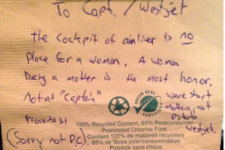
He’s graced boxes of the hearty breakfast food for decades. Now “Larry” — the cheery, red-cheeked Quaker at the center of the Quaker Oats logo — is getting a little work done.

He’s lost his double chin and facial fat rolls. “We took about five pounds off him,” a designer from Hornall Anderson, the firm behind the redesign, told the Wall Street Journal. His hair has been trimmed to give him a neck, and Larry’s shoulders now show to make him seem strapping. But designers didn’t want a Joan Rivers-style transformation — designers have left his crow’s feet and twinkling eyes in place.

In addition to Larry’s nips and tucks, the logo itself has been revamped to include more red and gold at the bottom. Quaker Oats owner PepsiCo introduced the changes in an effort to make the brand “fresh and innovative,” which might take a bit of doing, given that their product is a dessicated cereal grain.

MORE: Nine Kid Foods to Avoid

  • Most Popular
From NewsFeed
  1. 13-Year-Old Girl Finds Porn On New Cell Phone
  2. Inside The Billion Dollar Matrix Lawsuit, One of the Internet’s Most Pervasive Legends
  3. These Are North Korea’s 28 State-Approved Hairstyles
  4. Top 10 Famous Love Letters
  5. Mountain Dew’s ‘Dub the Dew’ Online Poll Goes Horribly Wrong
From Time.com

Connect With TIME

  • Home
  • U.S.
  • Politics
  • World
  • Business
  • Tech
  • Health
  • Science
  • Entertainment
  • Newsfeed
  • Living
  • Ideas
  • Parents
  • Sports
  • History
  • The TIME Vault
  • Magazine
  • Subscribe
  • Give a Gift
  • The Goods
  • Press Room
  • Newsletters
  • Customer Service
  • Site Map
  • Privacy Policy
  • Your California Privacy Rights
  • Terms of Use
  • Advertising
  • Ad Choices Ad Choices
  • Careers
© 2023 TIME USA, LLC. All rights reserved.