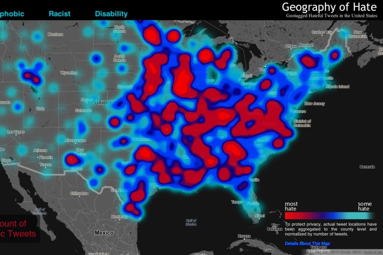
Skim the zoomed-out surface of Humboldt State University’s alarming “Hate Map,” and you’ll encounter angry clouds of bright red framed by smears of gloomy blue, as if some giant freak storm were raining down hell across the U.S.
(MORE: Star Wars and Doctor Who Fans Clash at Sci-Fi Convention)
What you’re looking at is actually a map created by pairing Google’s Maps API with a hailstorm of homophobic, racist and other prejudicial tweets. It’s part of a project overseen by Humboldt State University professor Monica Stephens, who, along with a team of undergraduate researchers, wanted to test for geographic relationships to hate speech.
Above the map, the words homophobic, racist and disability define alternate “hate storm” views, each describing a range of highly offensive terms. Click on the keywords or any of their subcategories and the map shifts, the splotches reorganizing to reflect occurrences of the selected term: bright red areas describe the “most hate,” while light blue ones describe “some hate.”
Creating a map like this is essentially about data plotting. In this case, HSU says the data was derived from “every geocoded tweet in the United States from June 2012 to April 2013” that contained keywords related to hate speech. How’d HSU collect all of that Twitter data? Through DOLLY, a University of Kentucky project that maps social media according to geography, allowing researchers to then comb through the data for patterns or correlations. But what about tweets that used the keywords in a positive (that is, “critical of them”) sense? HSU’s researchers read through the tweets manually, categorizing each as positive, neutral or negative — the map only displays the tweets categorized as negative.
What can the map tell us about hate speech in the U.S.? That’s where this gets tricky. Cycling through all of the views, you might conclude that racists, homophobes and the disability-bigoted plague the country from the Midwest to the East Coast (or that, conversely, things are fairly quiet from the Rockies to the Pacific). But as Stephens herself notes, “Even when normalized, many of the slurs included in our analysis display little meaningful spatial distribution,” and as she later tweeted, “in the East Coast the counties are smaller, so if a word is used in adjacent counties it appears as a hot spot,” which accounts for some of the East Coast–West Coast disparity.
It is a depressing picture — 150,000 insults aggregated over the course of 11 months. But what’s less clear is how any of this maps out demographically. For instance, the only attitudes captured here are of people who actually use Twitter and have geotagging enabled (slightly more than 1% of all Twitter users). Within that group, it only reflects those willing to engage in hate speech publicly (it’s also not clear that geotagging is indicative of where people actually are — Twitter itself says you need a third-party application to provide exact coordinates). What’s more, this approach narrows the definition of hate speech to specific terms and ignores broader, harder to capture speech. (Just because someone isn’t using these exact words doesn’t mean they’re not tweeting hateful racist or homophobic things, to say nothing of those with prejudices choosing not to express them on Twitter).
In any case, the map does seem to show that hate speech is sadly alive and well on social networks in the U.S.


